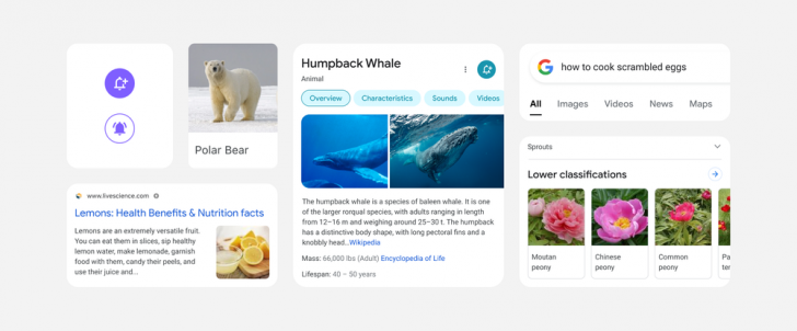
Google’s well known for extensively and silently testing different UI tweaks, sometimes for years before settling on something. So, it’s nice when the company outright announces an upcoming redesign — we know what to expect and look for before it’s thrust upon us. Just earlier today, Google teased us with what it calls a “bubblier,” “bouncier,” and more Googley refresh of Search on mobile. It’s expected to roll out in the coming days (though some folks may already have it) and honestly, it looks pretty good.
Left: Current search layout. Right: The new hotness.
This new version is a small half-step away from the card-based layout we’ve come to know over the last half-decade or so, with the white in each section reaching again to the edge — much more modern. More subtly, the long shadow between sections and results has been reduced, though the actual space between items remains about the same. The overall layout is also visibly more compact, probably at least partly due to that better use of space. Fonts in several places like tab titles have been swapped for Google’s in-house Product/Google Sans.
The tabs for different search types are also a bit easier to read, with the current section now bolded in black rather than highlighted in blue, and the line indicator beneath each section has been moved up from the edge (also black rather than blue). The tab titles are no longer all-caps, either. Above them, the search bar itself picks up a stronger shadow.
Tabs in the knowledge panel have been replaced by modern-looking buttons with a contrasting outline and text — likely better for accessibility. The knowledge panel header background is now white rather than a pastel shade, and the carousel of images has more strongly rounded edges at one side, visually indicating which direction to scroll much better. The button for notifications related to news and updates regarding the topic is now smaller and has been moved to the side, helping to save some vertical space. Formatting for Knowledge Graph details remains about the same, so far as we can tell.
I can’t reproduce this search for a direct comparison, sorry. My results look too different.
The text in results comes closer to the edge in general search results, with the sides of the “cards” gone. Although the size of and radius on the results thumbnail looks about the same, result page titles look to be slightly larger and easier to read. That shadow reduction reaches down here as well, making for a subtly cleaner (though still very familiar) look.
Google says the redesign is about “leaning into that “Googley” feeling,” with a bubblier and bouncier look evoking not just the Google logo, itself like 90% round elements, but our association with Google’s overall aesthetic. It’s intended to be playful — or, at least, not entirely sterile as with so much of modern design.
Google Search is continuously and subtly changing, but, as the company’s core and most widely-used product, it’s usually cautious to adjust things, not that its efforts are always ideal or successful. Last year, Google rolled out and then reverted a widely-panned favicon change on Search results for desktop making it harder to distinguish genuine results from paid advertisements. And back in 2017, it rolled out a major monochrome mobile Search redesign, which was soundly rejected by the internet.
Google doesn’t always make the right call with its sometimes arbitrary-feeling redesigns, but I’m looking forward to this one. I think the new mobile Search design looks good and meshes well with the direction Android is slowly heading in.
According to the announcement, the new interface for mobile Search will be rolling out “in the coming days,” though at least some of our readers report seeing it already. It wouldn’t be Google without a nice slow soak test.


